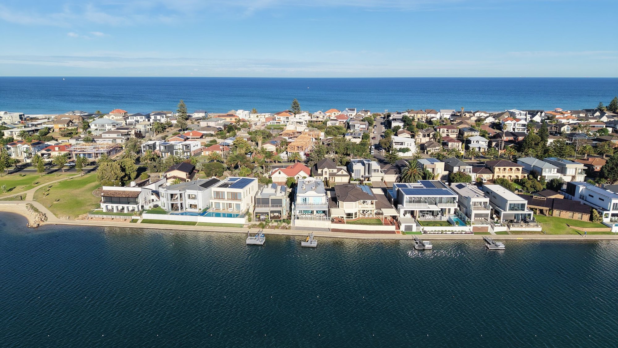

Every headline this spring says the same thing. The market is falling, buyers have vanished, sit tight and wait. The herd who follow the mainstream media will sit on the fence. Meanwhile the savvy investors know that it is during exactly these periods that you find the best deals. And it is not all bad news. Here is what regional Australia did over the same twelve months.
12 months to August 2026
12 months to August 2026
12 months to August 2026
Over that same year the combined capitals managed 1.1 percent. And the gap has kept widening since. On Cotality's September figures the capitals are now down 1.8 percent across the year while regional Australia is up 5.6 percent, and PropTrack, which uses a completely different method, has it at minus 1.6 against plus 5.1. Two separate indices, same split.
So this is not a country where nobody is buying. It is a country that has stopped moving as one.
- Rates up again
- Clearance rates collapsing
- Forecasts in the red
- "The Australian property market"
- Wait and see
- Rents tight, vacancy near 1%
- Regional Australia up 5.6% while the capitals fall
- Ten year growth to +150% in parts of the coast
- Hundreds of separate markets, not one
- The quiet part of the cycle
We run sales records going back more than thirty years, across more than fourteen thousand Australian suburbs. After fifteen years in this market, the most useful thing I have taken out of all that data is that "the Australian property market" is a phrase that describes nothing. There is no such thing. There is Townsville, and there is Toorak, and they have almost nothing to do with each other.
When a headline says the market fell 1.8 percent, it is averaging a market that dropped 6 with a market that gained 9, and handing you a number that applies to no property anyone actually owns.

So let us do this properly. Before we name a single suburb, we want to walk you through how we decide, because the location is the easy part. Knowing why that location, for what strategy, over what timeframe, is where the money is made or lost.
First, the headlines are right
We are not going to pretend conditions are easy, because they are not. Here is where we actually sit as we write this.
Those first two numbers are why the mood is cautious. The third is why we are not. Rates have made buying harder, which has thinned out the competition, but the thing that actually sets rents and underpins values, which is the shortage of homes, has not improved at all. Those two facts are pulling in opposite directions, and when that happens the averages become meaningless and the individual markets start telling very different stories.
The property clock, and why it matters more than ever
Back in December 2017 we published an article called The Property Clock. The idea is simple. Every market runs through four phases, recovery, rising, peak and softening, and the Australian markets are never all in the same phase at the same time. When Sydney is at the top of its run, something else is at the bottom of its own.
We are going to grade our own homework on that piece, because it is the fairest way to show you what this tool does and does not do.
In 2017 we said Perth was finally showing the first signs of recovery after falling since 2014. Direction right, timing early. It took until about 2020 to really turn, and when it did it ran hard. We said Hobart was the strongest performer in the country but to be careful about how sustainable a market that small can be. That held up. And we said Melbourne was the market to be in for the short term and the long term, which did not play out the way we expected, because a pandemic and the policy response that followed it were not on anyone's 2017 bingo card.
The clock tells you the phase. It never tells you the hour. Anyone who says otherwise is selling you something.
That is the honest limitation and we would rather say it out loud than pretend otherwise. What the clock is genuinely good for is stopping you from buying at the top of a run that has already happened, and pointing you toward markets where the growth is still in front rather than behind.
01 Rising
Prices follow the volume that arrived before them. Competition builds, days on market shorten, and the story reaches the media. The run is real and still has legs.
02 Peak
Prices still climbing but volumes rolling over. Yields compress because rents cannot keep pace. The hardest phase to buy well in, and the one that gets written up as a hotspot.
03 Softening
Values flatten and buyers hesitate. Affordability quietly rebuilds. Where most Australian capitals sit right now, with six straight monthly falls behind them.
04 Recovery
Listings thin out and buyers quietly return. Volumes lift before prices do. This is where the best buying is, and where almost nobody wants to be.
Decide how long you are holding before you decide where
This is the step almost everyone skips, and it changes the answer completely. Two investors can look at the same list of markets and correctly pick opposite ends of it, because they are not trying to do the same thing.
Short term: manufacture the equity
- You are not waiting for the market. You are creating the uplift yourself, through a build, a renovation, a duplex or a small development.
- Take a duplex. Build two, sell one to clear the debt, keep the other. Or hold both and refinance the gain you just created.
- What you need is thorough research and real know how. Is the market right, do the comparables stack, will the council allow it, and can you finance it.
- Best suited to markets in recovery or early rising. You want the wind behind you, not a gale already blowing.
Long term: buy good while it is cheap
- You are buying a genuinely good market during a quiet patch, and letting time do the heavy lifting.
- What you need: affordability now, strong long run fundamentals, and the holding power to sit through the quiet.
- In every downturn the top of the market takes the biggest hit, because when money is tight people move toward affordability, not away from it.
- This is the case for Victoria right now, and we will come back to it.
There is a timing point sitting underneath all of this that deserves its own article, and we are writing it next. The short version is that while rates are climbing, the cautious money sits on the fence. The moment rates start coming down, that fence empties all at once and the market moves far faster than people expect. Our view is that we have another six to nine months of this, and that the turn starts around July next year. Which means the window to buy without a crowd is now, not then.
What we actually screen for
Here is the filter, in the order we run it. It is a funnel, not a checklist. Each stage removes markets, and what survives is a short list worth doing real work on.
Sales volume momentum
Are more people buying here than a year ago? Volume moves before price.
Supply versus demand
Listing counts, days on market, vacancy rate. The pressure gauge.
Economic diversity
How many industries hold this town up? One is not enough.
Affordability
Price to local income, not just the sticker. Who can actually buy here next?
Employment and population
Jobs being created, and people arriving to take them.
Infrastructure and liveability
Funded and committed spending, not announcements. Plus the reason people want to live there.
Yield and holding power
Can you comfortably carry it for three years if nothing happens?
Past growth versus future prospect
What has already been priced in, and what has not.
Why volume beats price, every time
If you take one thing from this article, take this. Price data tells you what already happened. Volume data tells you what is happening right now.
Think about how a market actually turns. Buyers do not all wake up and agree to pay more on the same morning. What happens first is that more of them turn up. More competition at inspections, more offers, more sales going through. Only after that does the price move, because it takes a run of competitive sales to drag the median up. Transaction volumes typically lead prices by something like six to twelve months.
So when a market has rising volumes and prices that are still flat, you are standing in the window. By the time the price growth shows up in a headline, the window has closed and you are paying for it.
The window
Buyers are returning but the price has not caught up. Best risk to reward on the board, and the least crowded.
Already running
Real and confirmed, but you are paying for what everyone can now see. Fine, if you go in knowing it.
Not yet
Nothing is happening. Could be a future window. Watch it, do not buy it.
Late in the run
Prices still climbing on thinning activity. The riskiest square on the board, because you are buying the end of a run on the strength of the headline it created.
Economic diversity, or why we avoid mining towns
This one is simple to say and expensive to ignore. Before we look at a single number in a regional market, we ask what holds the town up. If the answer is one industry, we are out.
The classic version is a single employer mining town in Western Australia or central Queensland. On paper they look extraordinary. Rents are enormous, yields can run into double digits, prices look cheap. What that yield is actually pricing is risk, and the risk is that the entire local economy answers to one commodity price and one company's capital expenditure decisions. When the project winds down, the workers leave, and they all leave at once. Your tenant goes, your buyer pool goes, and your valuation goes with them. There are towns in this country where houses sold for over half a million dollars and later changed hands for under a hundred thousand. That is not a market correction. That is an industry leaving.

Contrast that with somewhere like Townsville. Defence, mining services, port and logistics, health, education and tourism all operate in the same city. If one of those has a bad decade the others carry the load. That diversity is why a market can absorb a shock instead of falling through the floor. It is also why we will take a 5 percent yield in a diversified regional city over a 9 percent yield in a one industry town without thinking twice about it.
The test: if the largest employer in town closed tomorrow, would the local property market still have tenants and buyers? If you cannot answer yes with confidence, treat that high yield as a warning rather than a reward.
Yield is not greed right now. It is essential.
In a low rate world yield was a nice extra. At 4.60 percent it is the thing that decides whether you can hold the asset long enough to get the growth you bought it for. That is the whole argument. Growth is what makes you money, and yield is what keeps you in the position long enough to collect it.
Here is the part that gets missed. Because values are easing while rents keep climbing, yields are actually going up. Cotality has the national gross yield at 3.8 percent in August, the highest it has been since September 2019, and it has risen every single month since bottoming at 3.5 percent early this year. The combined capitals are at 3.6 percent, their best since July 2019. A falling market quietly improves the income side of the equation, which is the opposite of how it gets reported.
This is also why the most expensive markets are not automatically the best ones. The top end of the market carries the lowest yields, the largest holding costs and the biggest falls when conditions tighten, because the buyer pool at that level is the first to disappear.
So where are we actually looking?
Now the part you came for. We want to be clear about what follows. These are markets we watch and markets where we have placed clients. They are not a shopping list, and we will explain why directly after it.
The coast and the regions, where the country is quietly relocating
The shift that started with remote work never went back. People worked out they could keep the income and change the postcode, and at the same time our big cities absorbed very large numbers of new arrivals. The result is a steady movement of Australians toward coastal hubs and regional centres with real services.
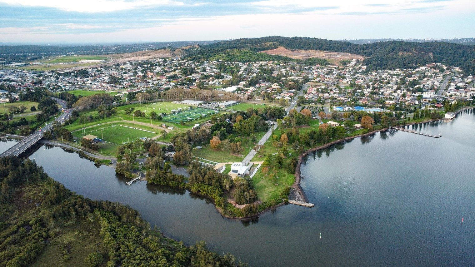
Here is the ten year picture across the coastal and regional markets we follow most closely, measured on sales weighted medians from the Pricefinder database.
Kingscliff deserves a note. A median that went from $495,000 to over $1.2 million in a decade is a reminder of what happens when a small coastal market with a hard supply limit meets a national migration trend. Hervey Bay sits just north of Noosa, which has been one of the strongest growth markets Queensland has produced, and has done 130 percent in its own right while remaining a fraction of the price.
Now look at the same markets on volume
This is where it gets interesting, and where our screen earns its keep. Ten year growth tells you what a market has already done. Volume momentum tells you what it is doing now.
| Market | Sales volume, 2025 vs prior 3yr average | Read |
|---|---|---|
| Bendigo, VIC | +36% | Strongest volume lift on our screen. Victoria, quietly busy. |
| Geelong, VIC | +35% | Same signal, second largest city in the state. |
| Coffs Harbour, NSW | +17% | Volume and price both still moving. |
| Port Macquarie, NSW | +15% | Steady rather than spectacular. Reliable. |
| Kingscliff & Tweed, NSW | +14% | Activity returning after a very large run. |
| Newcastle, NSW | +8% | Deep market, modest lift, below average yields. |
| Hervey Bay, QLD | +3% | Holding its volume after a sharp cycle. |
| Toowoomba, QLD | -5% | Cooling off the boil. |
| Townsville, QLD | -9% | Past the frenzy. Still diversified, just no longer cheap. |
Read that table against the growth chart and a picture appears that you will not find in a hotspot list. The markets with the biggest ten year numbers are not the ones with the strongest current momentum. Bendigo and Geelong sit near the bottom of the decade chart and at the very top of the volume chart. That is the signature of a market in recovery, and it is exactly the quadrant we hunt in.
Victoria, the long game
Which brings us to the one we get the most arguments about. Victoria has had a hard few years and the result is that it is now one of the most affordable places in the country to buy into a genuinely world class city.
The gap between Sydney and Melbourne house prices is the widest it has been in more than twenty years. Melbourne's dwelling value to income ratio sits around 8.6 against Sydney's 10.6, and ANZ economists have Melbourne roughly 13 percent undervalued against its own historical relationship with the rest of the country. Melbourne also currently yields more than Brisbane and more than Sydney.
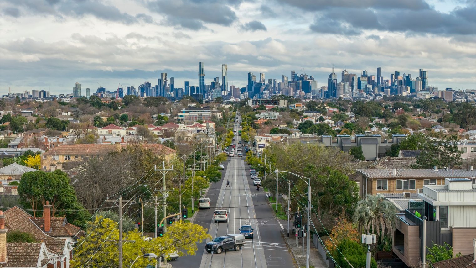
None of that is a prediction about next year. It is an observation, and the volume data in regional Victoria has already started to move. Over a ten year horizon we think that gap closes, because it always has. Right now, Victoria is where the affordability is, and affordability is what every recovery gets built on.
South East Queensland, excellent and expensive
Everybody wants South East Queensland and the reasons are good ones. Interstate migration is strong, the housing shortage is real, and there is somewhere around 11 billion dollars of Olympic related construction running from late this year through to 2031, most of it designed as permanent infrastructure rather than temporary venues.
We are not talking anyone out of it. We are asking you to look at the price of entry. Brisbane's median is now within about 470,000 dollars of Sydney's and closing, while yields sit at roughly 3.4 percent, second lowest of any capital. It is a very good market that is no longer a cheap one, and the growth from here has to be earned rather than caught. If you are buying South East Queensland in 2026, buy the specific asset, not the postcode.
Perth and Sydney, in short
Perth went roughly eighteen years going nowhere before it moved, which tells you something important about that market. It has long flat stretches and then it runs hard, and it ran hard alongside Brisbane from 2020. Forecasters still have it positive into next financial year and we would not argue with them. We would simply note that it is much later in its cycle than it was, and the easy part of that run is behind us.
Sydney will always be a solid long term hold, and it is the deepest and most liquid market in the country. The catch is the entry price. At a median above 1.2 million dollars, one Sydney purchase ties up the borrowing capacity that would have bought two properties somewhere else. That makes it a market for investors with the income to carry it, rather than one for building a portfolio quickly.
Now the part that most of these articles leave out
Everything above is market selection. Market selection is the first filter. It is not the job.
A median is the midpoint of every sale in an area, the clever buys and the terrible ones together. When we show you that Hervey Bay did 130 percent over a decade, we have told you the tide came in. We have told you nothing about whether the specific house, at the specific price, on the specific street, with the specific flood overlay and the specific build cost, was a good purchase. Plenty of people bought in every market on that chart and did badly.
Showing you a market that grew is not the same as showing you a deal that works. The gap between those two things is the entire job.
The same applies to strategy. A duplex is an excellent way to manufacture equity, and it is also an excellent way to lose money if the council will not approve the second dwelling, if the site has services in the wrong place, if the builder is not a genuine dual occupancy specialist, or if the finished product lands in a suburb where nobody wants two of them. We have clients who have made serious gains doing exactly this. That is not because duplexes are magic. It is because the site, the approval pathway, the builder and the numbers were checked before anyone committed.

That is the honest reason people use an advisory team. Not because the information is secret. Most of it is public if you know where to look and have the time. It is because the distance between a good market and a good purchase is filled with specific, boring, checkable detail, and getting one of those details wrong costs more than the advice ever did.
What would make us wrong
We would rather tell you this than have you find it out yourself.
- Rates going further than expected. If the Reserve Bank keeps lifting well beyond here, borrowing power keeps shrinking and the recovery we are expecting gets pushed out. That hurts a short term strategy much more than a long term one.
- Tax changes from July 2027. Negative gearing is being restricted to new builds and the capital gains model is changing. That alters the maths on established stock and it is not yet legislated, so the detail can still move.
- Thin markets cut both ways. Small markets rise fast because it does not take many buyers to move them. They fall the same way, and when you want to sell there may be nobody there.
- Our volume data runs to the last complete year. It is the best leading indicator we know of and it is still a rear view mirror with a very short delay. It tells you the direction of travel, not tomorrow's weather.
The bit we actually believe
There is a line of Warren Buffett's that gets quoted so often it has lost its teeth, so we want to put it back in context. Be fearful when others are greedy, and greedy when others are fearful.
In 2021 everyone was greedy. Money was free, every market was running, and buying was easy and crowded and expensive. Today the headlines are negative, clearance rates are under half, and most people have decided to wait and see. Vacancy is still around 1 percent. The country is still short of homes. Several markets are still transacting more than they were three years ago.
This is the part of the cycle where experienced investors move and everyone else waits for permission. The permission arrives in the form of a positive headline, and by then the price has already moved. We are not telling you to rush. We are telling you that the research window is open right now, and it will not be open once rates turn.
Next in this series
This article is deliberately national, which means it is deliberately broad. Where to invest in Queensland and where to invest in Victoria are genuinely different questions, because planning rules, land tax, stamp duty, build costs and buyer behaviour all change the moment you cross a border. So this is the first of a series, and each state gets its own piece.
If you want to talk through where your budget, your borrowing capacity and your timeframe actually point, that conversation is free and it is the one worth having before you start shortlisting. You can reach us through the contact page, or read more about how we work.
Common questions
Where is the best place to invest in Australia in 2026?
Is 2026 a good time to buy an investment property in Australia?
What is the property clock and how do I use it?
Why do sales volumes matter more than price growth?
Which Australian capital city has the best rental yield?
Why do you avoid single industry mining towns?
Does strong growth in a market mean any property there will do well?
Is Melbourne a good investment in 2026?
Sources
- Reserve Bank of Australia, Cash Rate Target (4.60 percent effective 30 September 2026, following increases in February, March, May and September 2026)
- Pricefinder database, suburb level transaction and sales weighted median records, calendar 1993 to 2025 (ten year regional growth figures and sales volume momentum, calculated across every suburb in each region)
- My Housing Market, Dr Andrew Wilson, capital city price and auction clearance reporting, 2026
- Domain, FY27 Housing Market Forecast, and ANZ Research capital city price forecasts, 2026
- ANZ Research, Melbourne relative valuation estimate, 2026
- Cotality, Monthly Housing Chart Pack and Home Value Index, August and September 2026 (gross rental yields by capital and region, annual change in dwelling values, combined capitals against combined regionals)
- PropTrack Home Price Index, September 2026 (sixth consecutive monthly fall, regional against capital city annual performance)
- CBRE, estimated Brisbane 2032 Olympic related construction value, late 2026 to mid 2031
- Australian Bureau of Statistics, regional internal migration and population data
- Australian Treasury, Budget 2026-27 tax reform fact sheet (negative gearing and capital gains changes from 1 July 2027)